Author
Erik l'Heureux, Fong Hoo CHEONG
Email : Erik.LHeureux@monash.edu hcfong@hcfa.com.sg
Erik G. L'Heureux (PhD) FAIA is an award-winning architect, educator, and academic leader whose creative practice engages the dense equatorial city, with particular expertise in adaptive reuse, Net Zero energy design, and decarbonization. His work is characterized by simple monolithic forms and fnely tuned climatic veils that calibrate buildings, interiors, and experiences to the hot, humid air of the urban equator — transforming climate into a medium for delight and surprise.
He is Professor of Design and Decarbonization and Head of the Department of Architecture at Monash University. From 2003 to 2025, during his tenure at the National University of Singapore, he served as Dean's Chair Associate Professor, Vice Dean, and Director of both the Undergraduate and Master of Architecture programs. In these roles, he led award-winning Net Zero energy retrofts and advanced design strategies that lock in embodied carbon while signifcantly reducing operational emissions.
Through an integrated approach to creative practice, design research, and pedagogy, Erik advances architecture's capacity to address the climate crisis. His teaching and practice equip the next generation of architects to critically engage with a warming world, shaping a more resilient, inclusive, decarbonized — and Beautiful — future.
Q: This project seems to be concerning renewal, reassessment of what is the current agenda of Architecture. As a teacher in NUS and also the designer you have a unique insight. I have questions that will let our reader understand more. What was the original design basis for NUS and why do the buildings look like this in 1980. Any comments on OD 205's master plan etc. ?
NUS, which now houses the Equatorial School of Architecture, occupies the western edge of the Kent Ridge campus — a site shaped by late-1960s planning ideals. The original campus plan, OD205, was conceived as a decentralized, infrastructural network — more circuit board than civic ensemble — refecting the industrializing ambitions of Singapore during that period. The architectural manifestation was consistent and systematized: a modular grid of reinforced concrete columns, aluminum sunscreens, yellow-painted soffts, and brick pavers coursing across the ridge. This was a campus without a center, with faculties dispersed rather than clustered, each plugged into the larger network.
The architectural language of the time was one of mechanization and industrial promise. Mechanical systems — ducts, vents, chiller plants — were not hidden but celebrated, forming an iconography of modernity. Even before air conditioning was fully installed, the architecture anticipated it — projecting an ethos of mechanical comfort and environmental control. In many ways, this became an “aircongraphy”: a belief that climate could and should be controlled through technology, not through form, section, or material behavior.
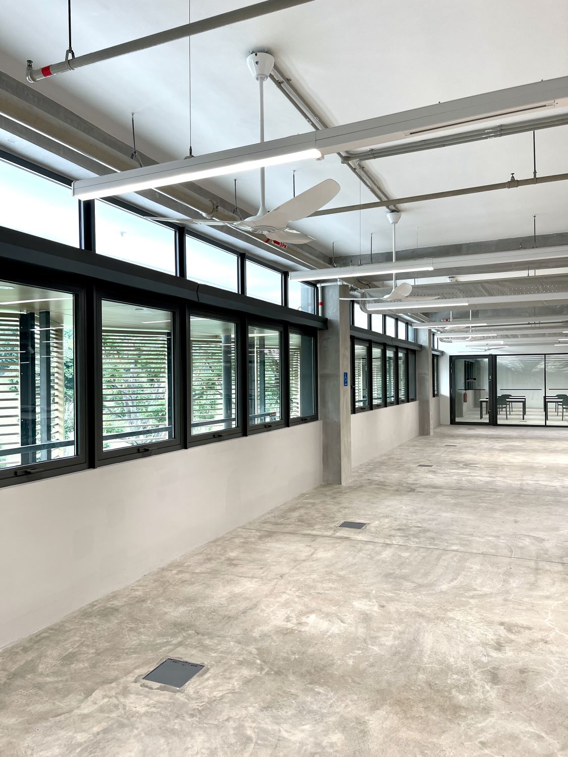
The redesign of SDE1 and SDE3 engages this legacy critically. While respecting the infrastructural clarity of the original grid, the new interventions seek to recalibrate its environmental assumptions — opening the buildings to air, light, and landscape through passive strategies and breathable envelopes. Here, comfort is not imposed but negotiated — through climate-responsive forms, adaptive reuse, and low-carbon light weight material assemblies — anchoring a new architectural ethos for an equatorial school of architecture.
Q: What was SDE 3 as a builidng before and why did you set up to change it so much?
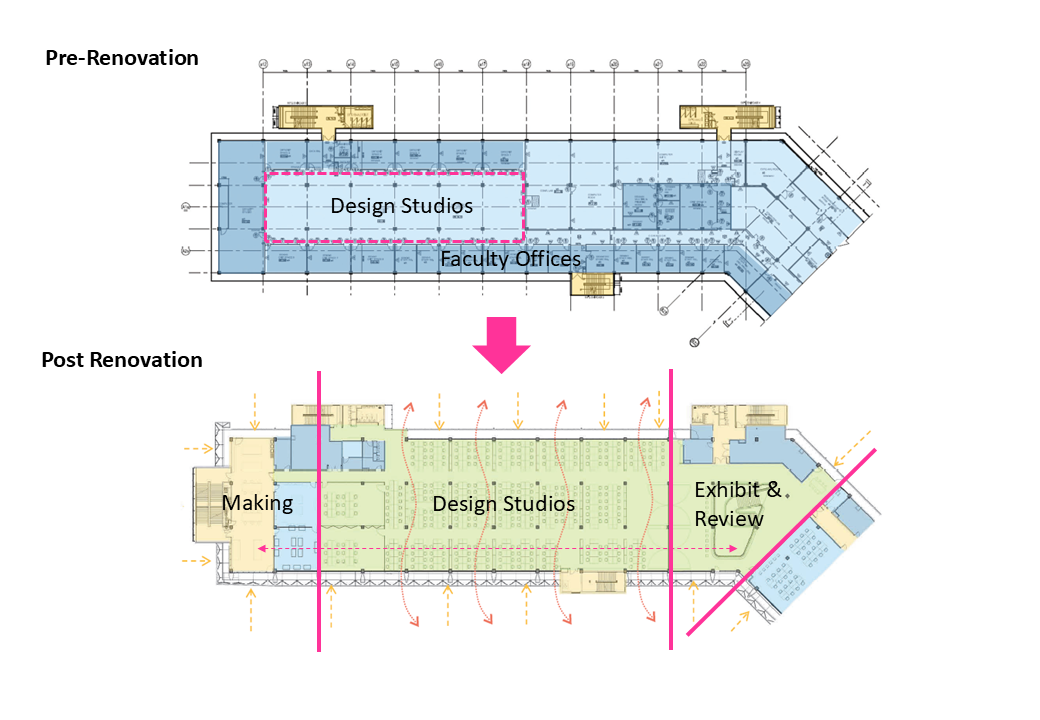
SDE1 and SDE3 were originally academic buildings, but each presented a distinct set of spatial and pedagogical challenges. SDE1 primarily housed faculty and departmental offces alongside small-scale teaching rooms. Its layout surrounded a temperate lawn, but the offces were internally oriented — cut off from daylight, views, and connection to the landscape. SDE3, on the other hand, was conceived as a vertical stack of disconnected foor plates. Studios were confgured as enclosed "fshbowl" spaces, encircled by faculty offces. This spatial arrangement limited transparency, obstructed natural fow, and reinforced the idea of studio as an isolated, siloed activity — making cross-cohort learning and informal exchange diffcult.
SDE 3 also suffered from the presence of raised foors and low air-conditioning plenums, which imposed a white-collar, corporate atmosphere — more beftting an offce tower than a school of architecture. It became clear that a fundamental rethinking was required, not just in form, but in pedagogical intent and spatial ethos.
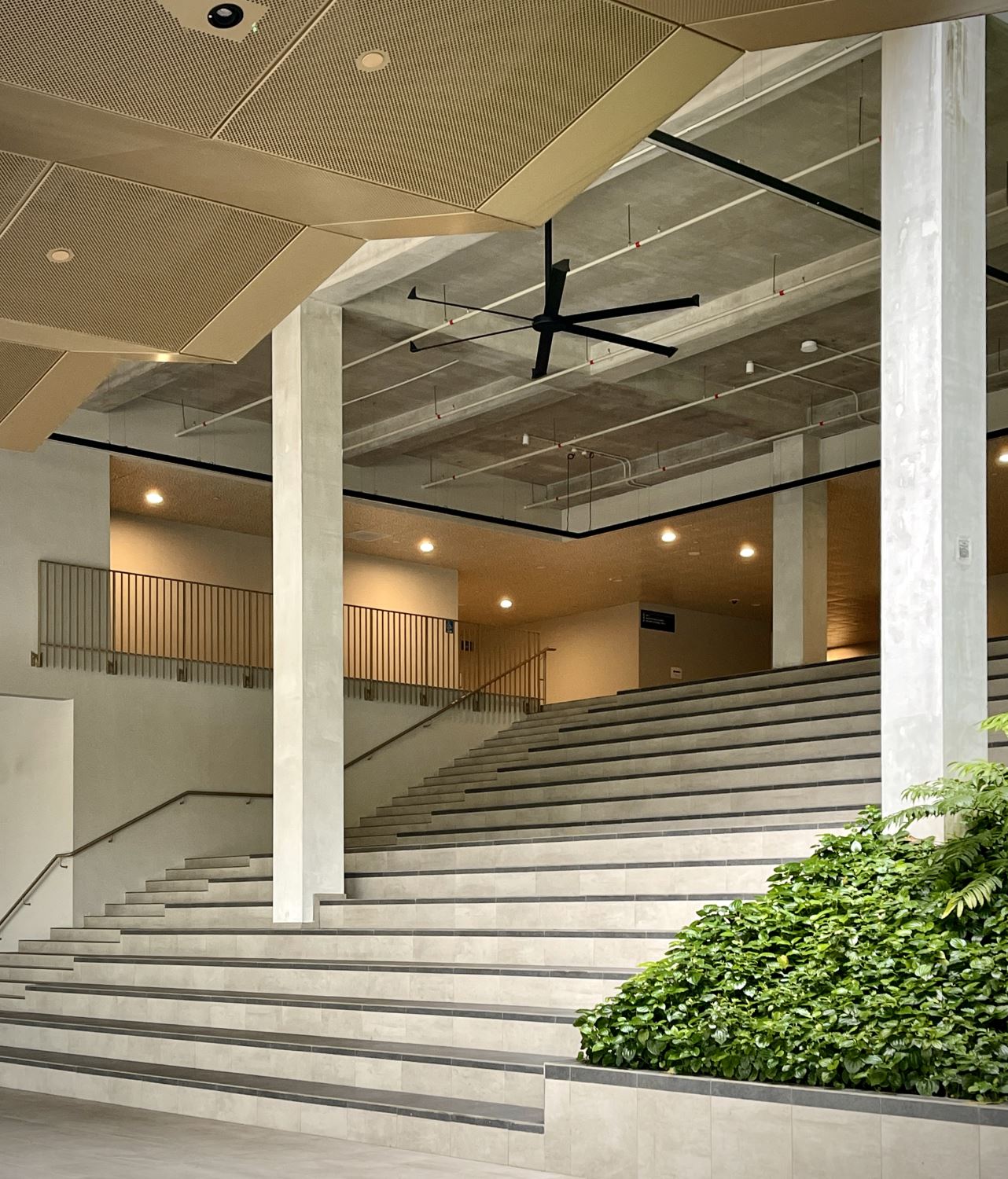
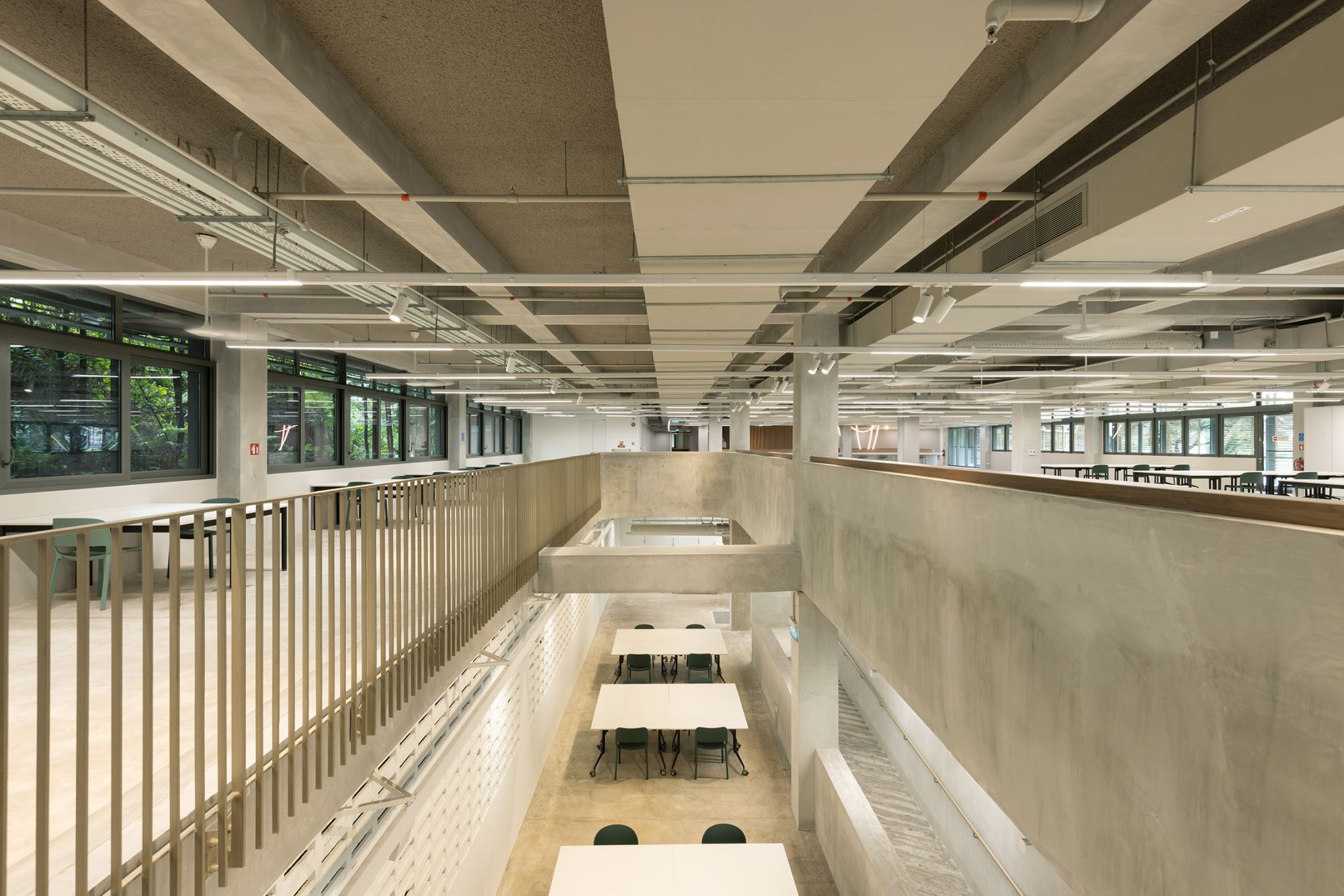
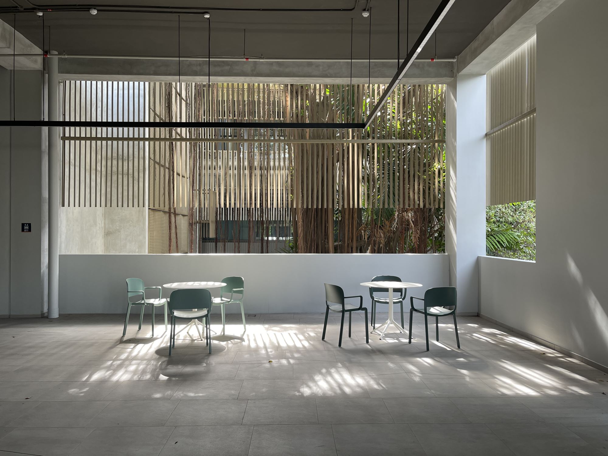
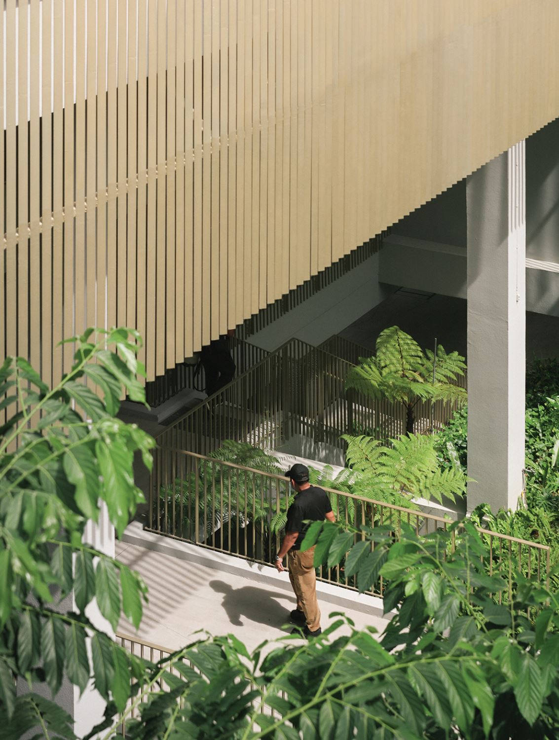
The redesign adopted a deliberately stripped-back strategy, working with elemental architectural tools: access to daylight and views, visual and physical openness, biophilic integration, and a renewed sense of spatial generosity. In SDE1, the temperate lawn in the courtyard was replaced by a dense, equatorial jungle planted at the heart of the building. This move reoriented the architecture school around the local climate and ecology — embedding a tropical landscape into its core. Framed views from department offces now look into this lush courtyard, reestablishing a continuous relationship with the surrounding environment. Studio spaces in SDE 3 were radically opened up — not just physically, but pedagogically — with an emphasis on student- centered design. The result is a more porous, breathable, and socially engaged architecture that redefnes what a school of architecture could be in the equatorial context. A large social commons staircase links all three levels of the building. It moves away from mechanical containment and institutional closure toward a more open-ended, collaborative, and climatically responsive form of learning and making.
Q: These images seems to point to deeper intent that leads to the "how did you make the intent real" question.
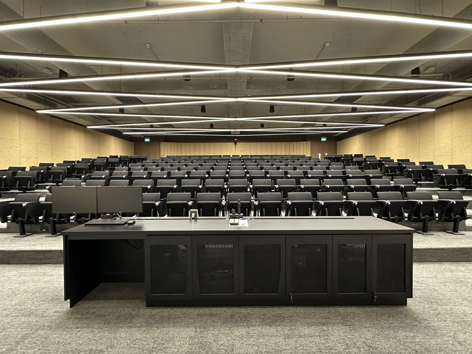
In designing the social commons staircase space in SDE3, I was particularly interested in how light could shape both atmosphere and behavior — how illumination could turn the space into a kind of social condenser, a gravitational center that draws people in. The use of teak laminate paneling was intentional, referencing the timber legacies of Southeast Asia while capturing and refecting daylight from the full-height window wall fanking the stair. The original design proposed a skylight that would punch through to the roof, doubling as a thermal exhaust and vertical light shaft. Unfortunately, this feature did not survive the budget cuts.
We also installed catenary rope lights to enhance the ambient glow and accentuate the inviting quality of the space, though these were later removed by a new administration. Still, the natural daylight remains — and in the late afternoons, it creates a luminous moment that recalls Vermeer's fascination with light cascading softly into interior spaces. On the equator, sunlight is often diffuse and bleached by humidity, but here, the low afternoon sun flters through the building envelope to produce a hazy, golden illumination — a quiet, atmospheric gift that anchors the space in time and place.
Q: Readers would be very keen for you to connect these images which seem to dicuss space and transformation. When you made these images or juxtaposed them what were you keen to let us know?
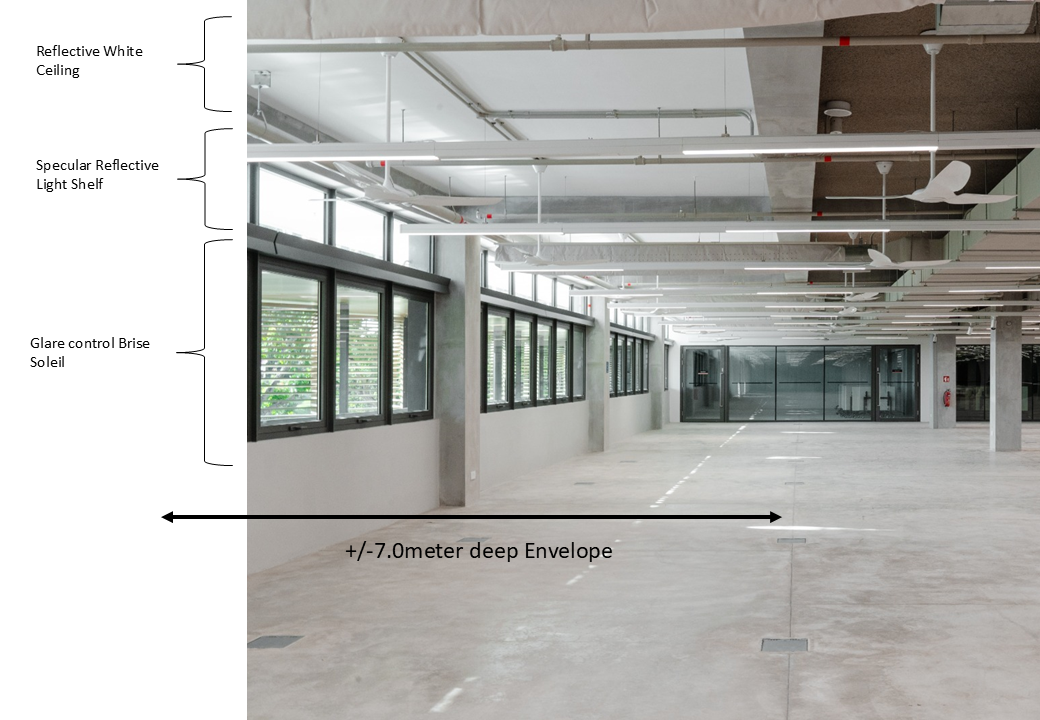
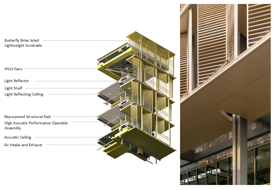
The image captures the lightshelf in action — channeling daylight deep into the 24-meter foor plate. The illuminated clerestory registers high light levels, while the white-painted ceiling above further amplifes refectance, distributing light evenly throughout the space. What's signifcant here is that the building envelope is not merely a façade or outer screen; it actively traverses both exterior and interior, in this case spanning a full 7 meters. This section reveals that the architecture of the envelope is not skin- deep — it is volumetric, spatial, and environmental. The envelope becomes a thickened zone of performance, demonstrating that climate-responsive architecture is not applied, but deeply integrated into the body of the building.
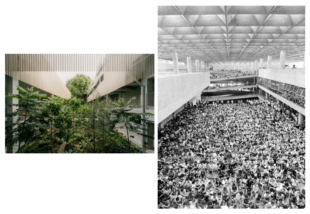
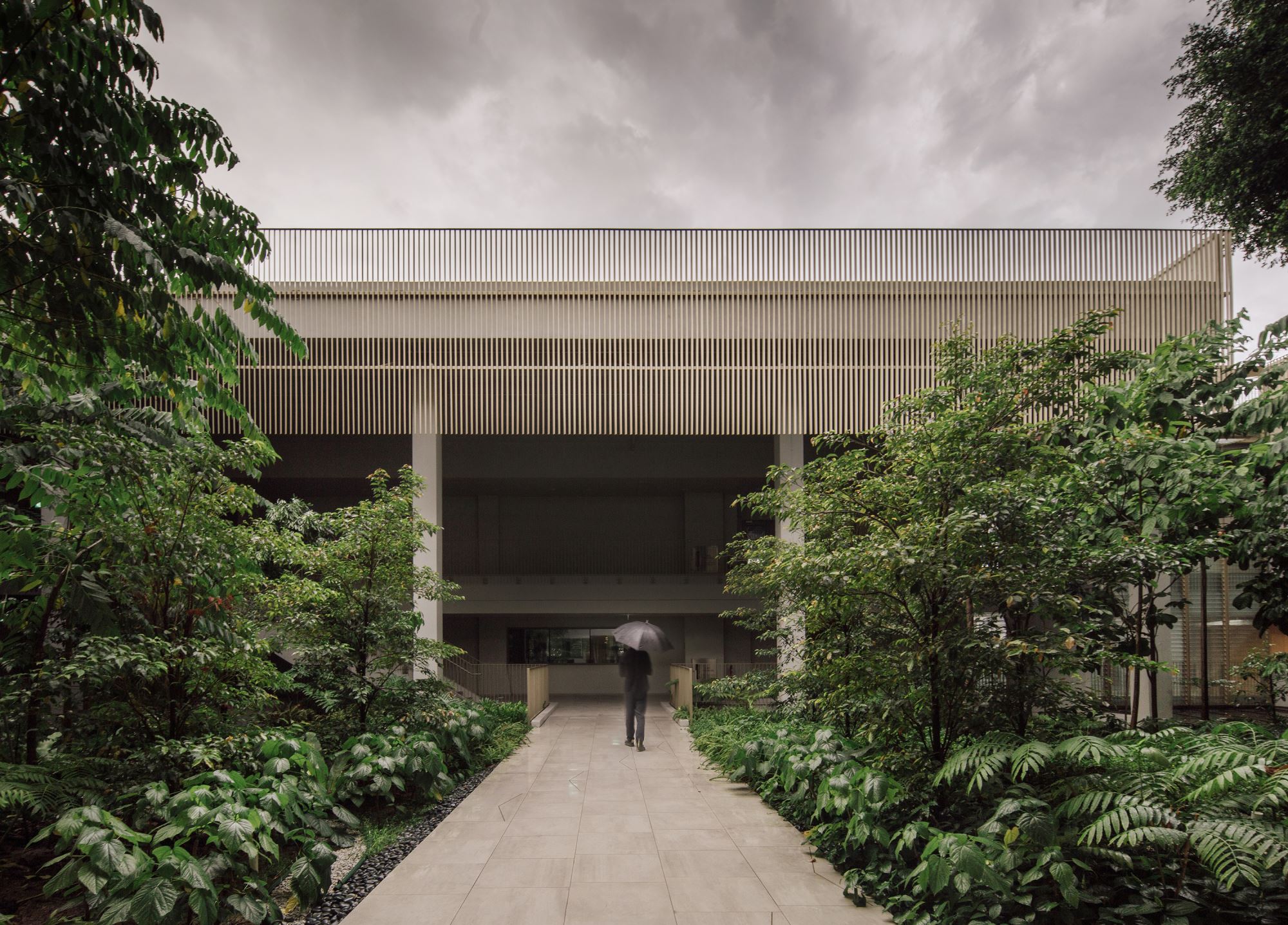
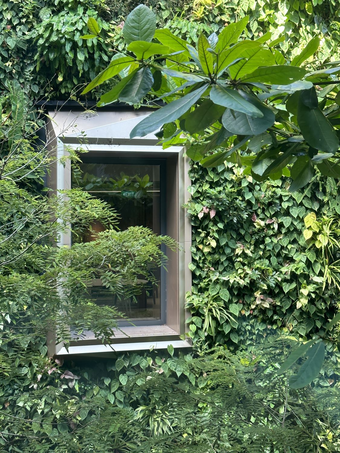
The juxtaposition between the jungle courtyard at SDE1 and the central social space of João Batista Vilanova Artigas' Faculty of Architecture and Urbanism (FAU) building at the University of São Paulo is purposeful. Both courtyards share a similar proportion — relatively long in relation to their width — and serve as the spatial and symbolic heart of their respective buildings. At SDE1, the original courtyard featured a temperate lawn and an air-handling tower, elements that felt out of place in the equatorial context. Replacing them with dense, tropical fora was a deliberate act of climatic and cultural reorientation.
Encircling the jungle is a golden crown that frames the landscape with luminous contrast — tropical green set against a warm metallic hue. The crown is not merely decorative; its vertical fns are precisely calibrated to block the intense western sun, while its form subtly adapts to the existing building fabric — lying fat along the west and gently angling on the east to accommodate inherited rainwater downpipes. It serves as both climatic device and spatial frame — a unifying architectural gesture that dignifes the transformed courtyard.
There is, of course, a quiet political commentary embedded in the juxtaposition of these two courtyards — captured from nearly identical vantage points. At FAU–USP, designed in 1961 by Artigas, the central space has long been a site of social gathering, political activation, and student life — an architecture of openness and resistance. At SDE1, shaped by the particularities of Singapore, that center is now occupied not by people, but by a jungle. I leave the deeper reading open to interpretation, but the substitution is intentional — raising subtle questions about publicness, collectivity, and the architectures of expression in different institutional and cultural contexts. It remains one of my favorite moments in the project — a playful, layered reference to architectural schools of thought, both literal and metaphorical.
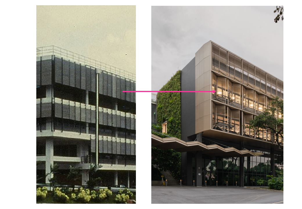
The original design that I developed in 2015, included a plan to repurpose and recycle the existing aluminum fns from the 1970s building — a direction that aligned with both sustainability, lifecycle, circular economy goals and the architectural legacy of the campus. This intention was formally documented in the tender drawings. However, during the bidding process, no façade contractor was willing to assume liability for the reused aluminum elements. Around the same time, a change in university leadership introduced further hesitation: neither the new administration nor the dean was willing to carry the legal risk associated with repurposed materials. As a result, the idea — though meaningful and technically sound — could not be realized.
Still, traces of that original intention remain embedded in the fnal design. The scale and proportion of the new façade refect the dimensions of the original aluminum members, preserving a continuity of rhythm and register across time. I often say the design intent was right — the ambition was there — but the economic and construction ecosystem simply wasn't ready to support it.
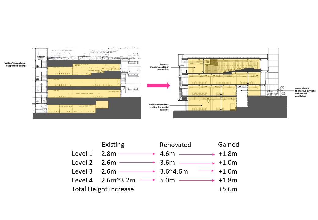
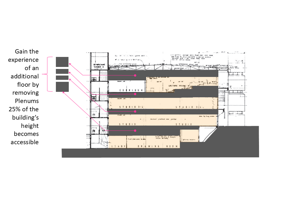
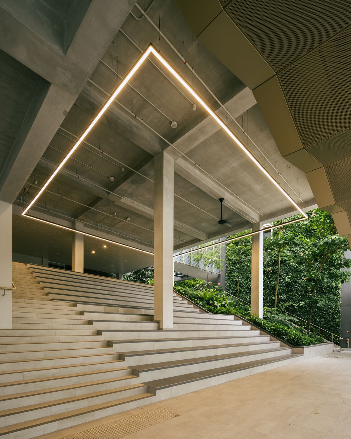
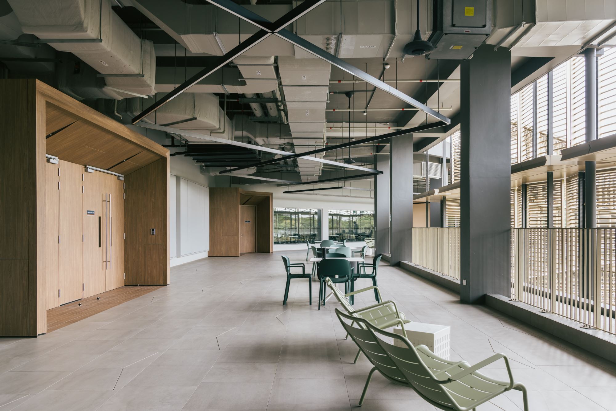
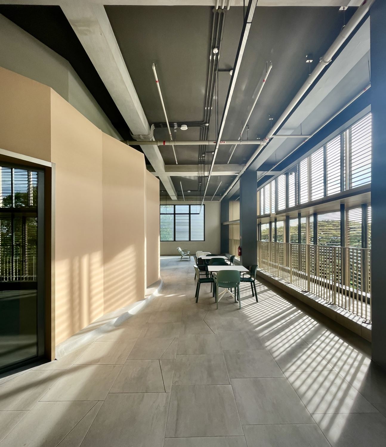
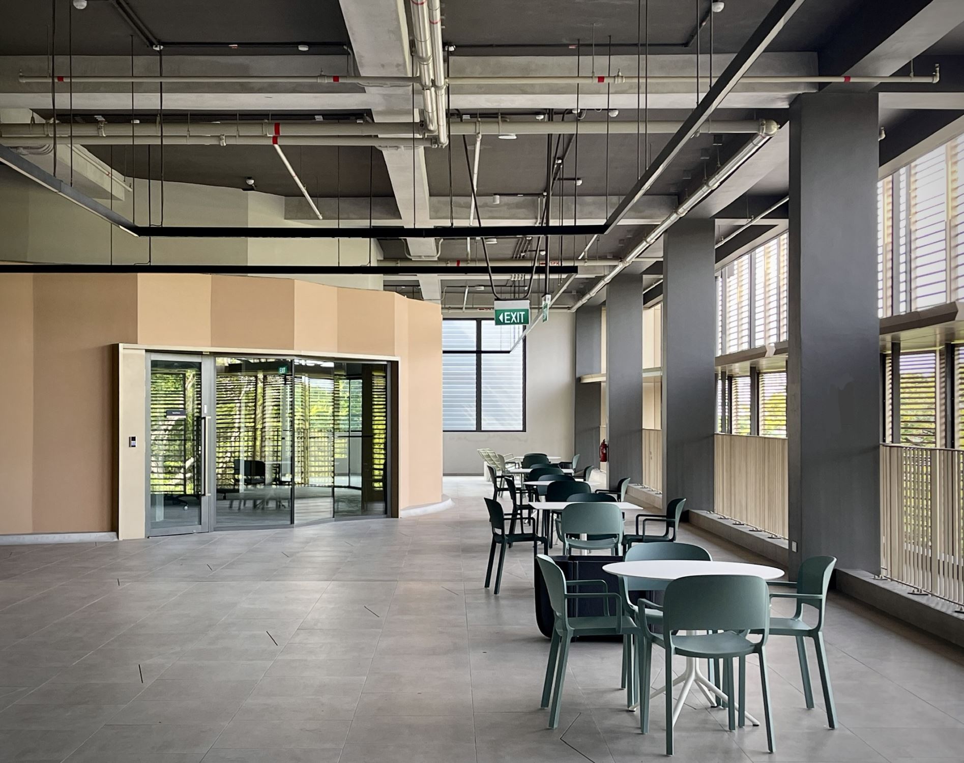
By removing the plenum and the layers of mechanical detritus once concealed above the acoustic false ceiling, we were able to reclaim approximately 25% of the original building height — equivalent to nearly a full story — and return that space to student and public use. Previously, this volume was occupied solely by mechanical systems, invisible yet dominant. In the redesign, that space is reallocated to people — to create height, to accommodate the air volume required by high-performance fans, and to foster a more open and generous spatial experience. What was once reserved for machines is now shared by the community, transforming the character and atmosphere of the interior.
Opening up the ceiling — typically reserved for concealing mechanical systems — required signifcantly more coordination across trades. In conventional construction, different systems such as refrigeration, electrical, lighting, fre protection, and plumbing often run independently, with little regard for spatial or experiential quality. Since everything is hidden above a dropped ceiling, visual order is rarely a priority.
In this project, however, removing the ceiling system meant every pipe, conduit, and duct would be exposed to view, making coordination essential. To manage this complexity, we developed a highly detailed digital twin — modeled down to the level of individual conduits — and worked closely with each contractor to ensure precision and clarity. The result is an exposed services ceiling that is both functionally effcient and visually composed.
You can see the evolution in coordination between SDE1 and SDE3. The early lessons learned from SDE1 — where exposed systems were more exploratory — were refned and advanced in SDE3. Indeed, the mechanical coordination at SDE3 is markedly more resolved, demonstrating how design intelligence can evolve across projects, even within adjoining buildings.
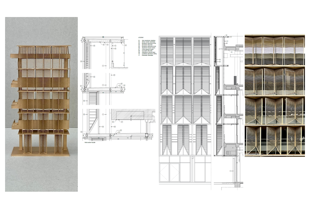
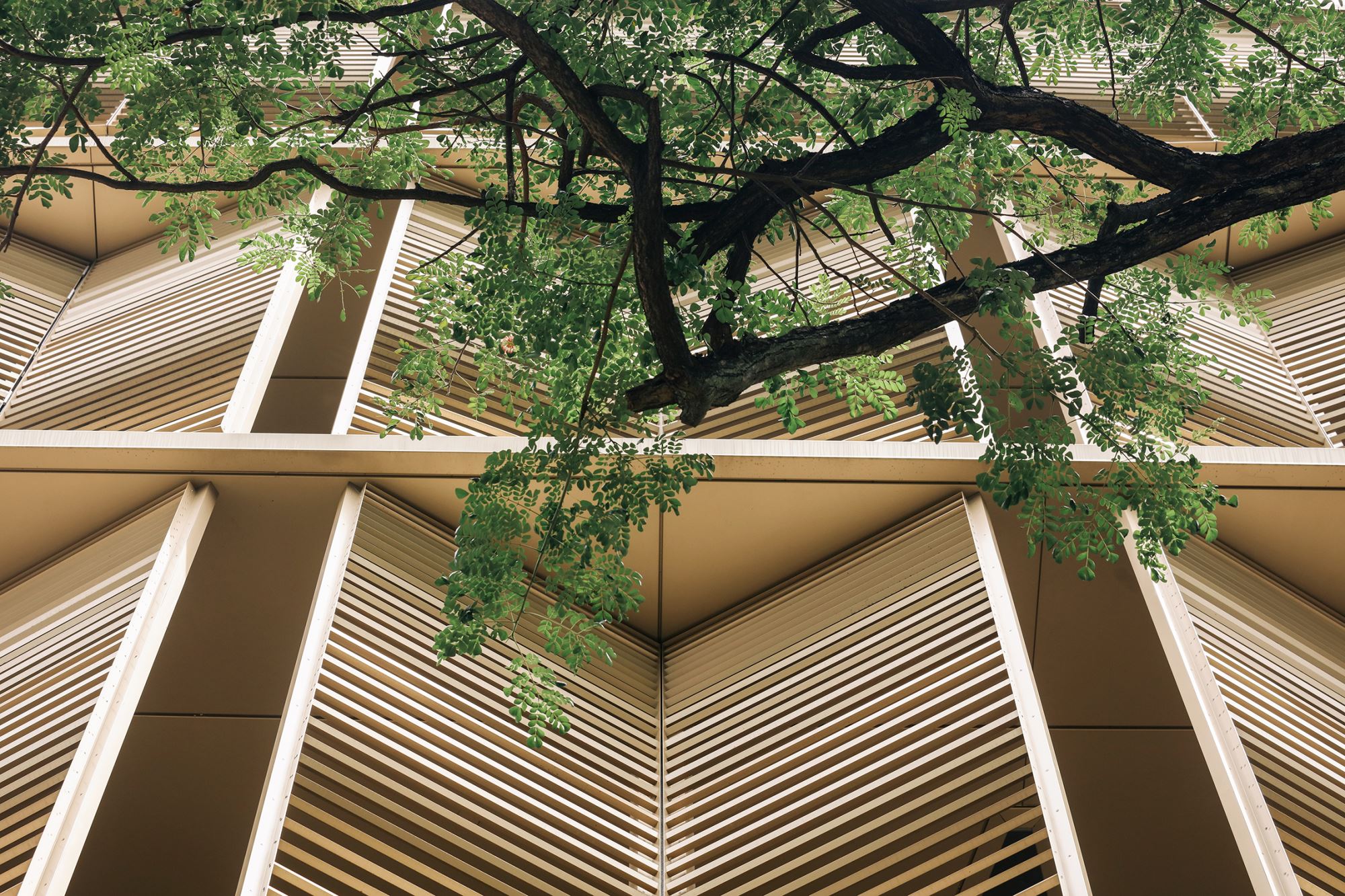
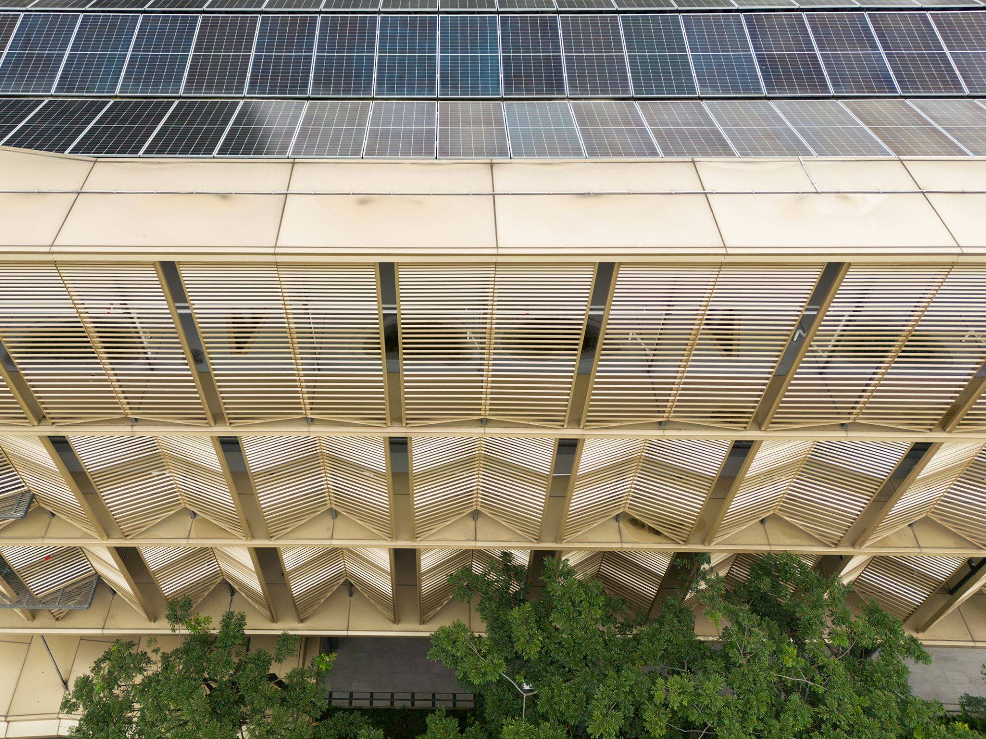
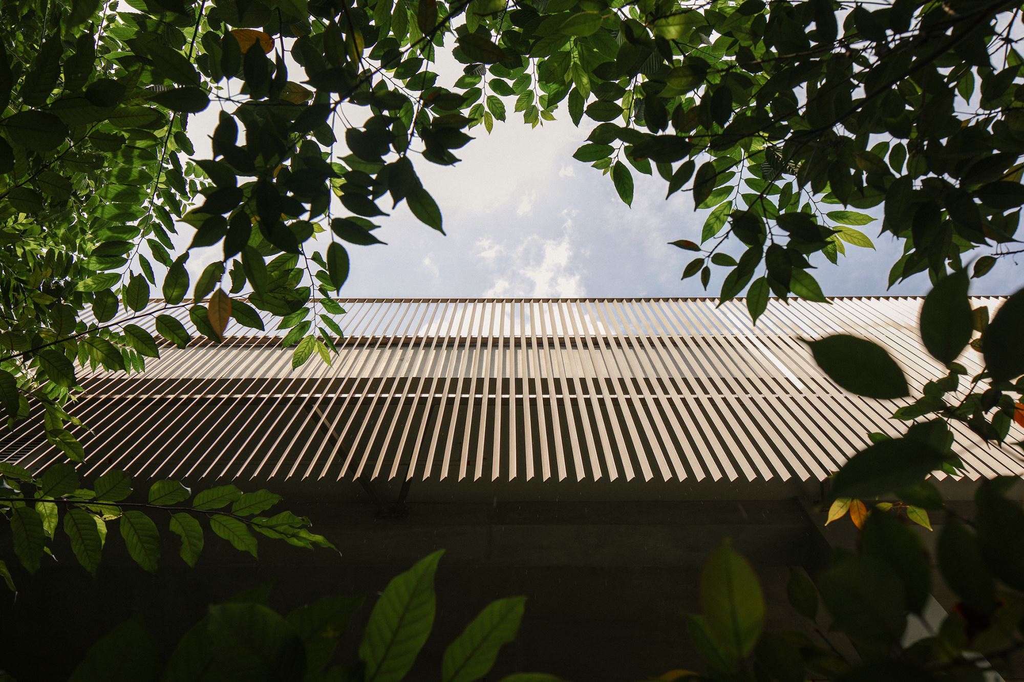
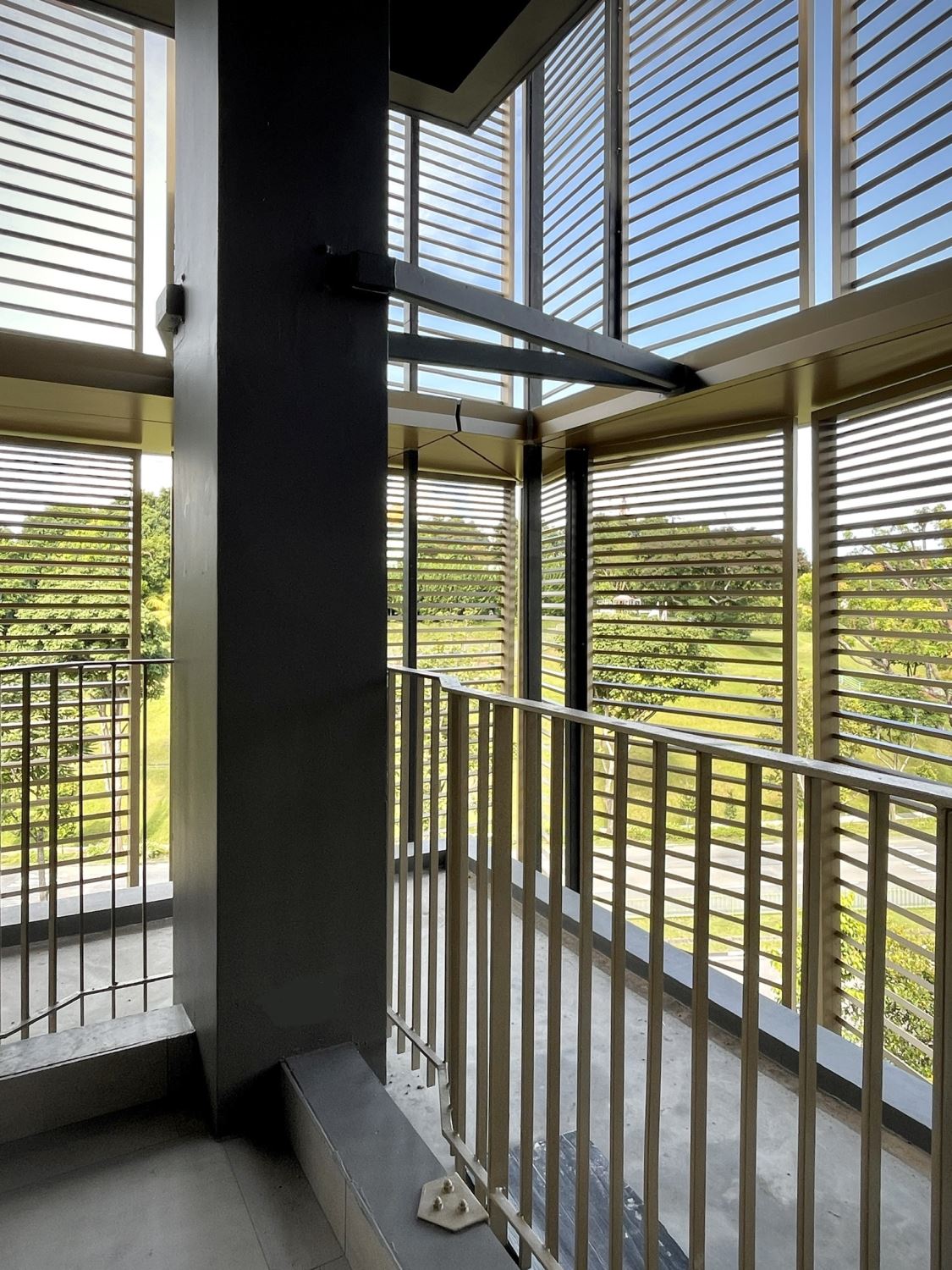
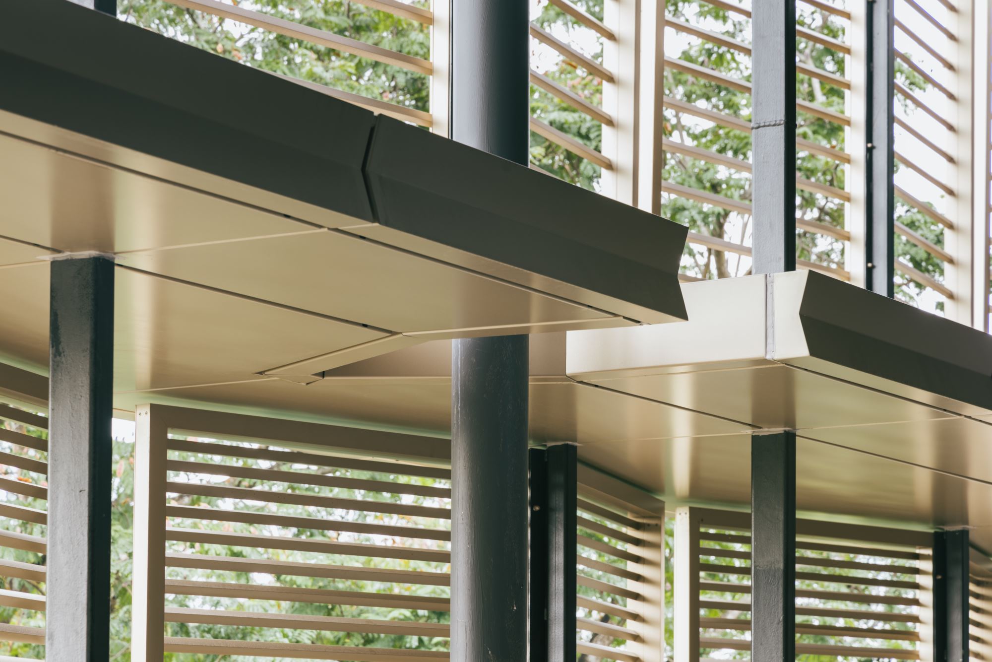
The building envelope was purposefully conceived as parasitic — designed to “clamp” onto the existing structural frame. This strategy emphasized the contrast between old and new, heavy and light, rough and refned. Rather than masking the original building, the new envelope reveals and frames it, drawing attention to their layered relationship. Careful detailing was developed at every point of intersection to highlight these differences while also expressing their interdependence.
For example, the envelope splays outward at existing rainwater downpipes and structural columns, creating a distinctive Y-shaped connection detail that articulates the meeting of systems. The original structure is painted a darker grey, while the new interventions are powder-coated in champagne gold — materializing the contrast and clarifying the architectural dialogue between the past and the present. These calibrated differences not only support the building's performance but also enrich its spatial and visual legibility, foregrounding transformation and reuse as central design values.
Q: Outcome images that seem to look at space in a specifc way. Please expand on how you relate space to detail in SDE3.
The images capture the deliberate contrast between the delicacy of the new insertions — the refned details of the envelope — and the rough, heavy presence of the original building. This tension between the precise and the crude is purposeful. The fnely tuned junctions, as refned as public work at NUS would allow, are set against the existing concrete screed fnishes, which retain their raw, utilitarian character. Rather than concealing these differences, the design makes them visible — foregrounding the interplay between old and new, fnesse and heft, precision and mass. The result is an architecture that embraces contrast as a narrative device, allowing the building's layered history to remain legible.
There is also a secondary visual play at work: the linear quality of artifcial lighting, shaped into dramatic geometries, contrasts with the softer, fltered daylight that passes through the layered building envelope. This interplay of light — designed and diffuse, artifcial and natural — adds another register of contrast and nuance. The photographic composition captures this tension as well, reinforcing the architectural narrative through the framing of shadows, alignments, and layered flters.
Q: Would be good to connect these impressive drawings to outcome images and your goals on space, plants , lights and climate?
The drawings similarly convey the solidity and mass of the original architecture, yet they extend beyond the building to include elements such as planting, ground, earth, topography, trees — and, in some cases, even air. These contextual layers are not merely given; they are designed. Each drawing is composed entirely of linework — eschewing solid flls or opaque poche — to maintain a sense of lightness and delicacy. For me, the precision of the line is a conceptual and representational precursor to the fligree of flter and screen that I seek in the architecture itself.
These drawings articulate relationships of scale and proportion, revealing how the project is carefully sited within its landscape. They also refect the same attentiveness to proportion and detail that is embedded in the built work. In this way, the drawings are not just representations but extensions of the architectural thinking — drawing attention to what is solid and heavy, but also to what is ephemeral, porous, and light.
Q: These are the most "human" of the set of images to show the builidng in action. 1. Any refections from others or anecdotes from them to share? 2. You too became a user for a few years. Any personal refections on what you have made?
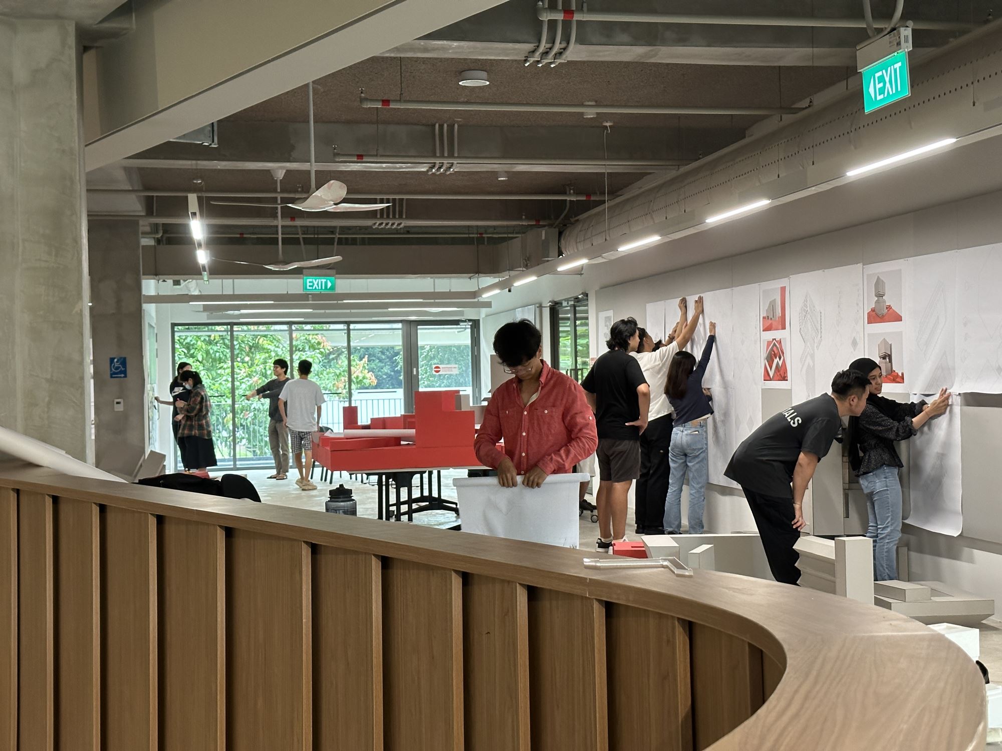
The building performs — and so do its inhabitants. That performance is always a loose ft, a constant negotiation and collaboration between architecture and its users. In the early days, there was hesitation: students and faculty seemed reluctant to pin up drawings or present models in the public review spaces surrounding the social commons. But over time, and through the initiative of a few studios that embraced a more open and public mode of learning, a culture of shared presentation began to take root. Today, there's a growing robustness to how work is displayed and discussed openly, engaging the larger architectural community. My hope has always been that students across different cohorts might cross-learn — simply by occupying the same space and encountering one another's work.
Of course, the relationship between designer and user is never simple. As an architect, I see all the missed opportunities — the compromises, the things that could have been if there had been more courage, more time, or more budget. But being a user of the building myself has allowed me to recalibrate how I think about design intent and actual use. For example, the ground foor gallery was designed as a fexible lecture space, but initially, it wasn't being used that way. I was able to initiate a few lectures there, setting a precedent and slowly shaping new patterns of occupation.
One regret remains: I had pushed to replace the clunky, ad hoc movable pin-up boards with a more thoughtful, integrated storage-and-display assembly — one that preserved airfow and visual continuity. Unfortunately, this proposal was canceled at the last minute by the previous administration. The grey boards persist, often awkwardly placed in ways that block daylight, restrict air movement, and unintentionally isolate studios from one another. This runs counter to the pedagogical vision of openness and transparency — one that encourages cross-studio and cross-cohort learning through shared visibility and proximity.
There is still more work to be done: not just in designing spaces, but in shaping how they are inhabited — to encourage users to prioritize daylight, views, and air movement over the maximization of pin-up surfaces. And, admittedly, one area I didn't give enough attention to was the management of refuse. While the design includes adequate external refuse areas near each studio, the recent addition of black trash bins and dumpsters scattered throughout the studio interiors has signifcantly diminished the spatial quality and atmosphere. These are not architectural failings per se, but cultural ones — habits and behaviors that must be cultivated over time.
In the end, the building is no longer my design project. It belongs to the community who occupies it. Architecture can set the stage, but it is the people who determine how the performance unfolds.
Q: Details clearly a focus and plays a strong role in character. The skin as flter of light, view, atmosphere and modulation of geometry. Your comments please.
At NUS, adaptive reuse projects are often perceived as second- tier — B-grade efforts aimed primarily at extending a building's lifespan by another decade or two. As such, they are typically assigned modest budgets, with little appetite for signifcant structural interventions or high-spec fnishes. Within this constrained framework, the challenge is not just design — it's care, speed, and ingenuity.
Interestingly, the tender process for such projects often proceeds with minimal detail. The real work of making architecture happens in the shop drawings, where precision and intention must be inserted late in the game. This demands signifcant commitment: working directly and intensively with subcontractors, resolving every joint, bracket, and edge condition on the fy. It's one of the few remaining opportunities where the architect can exert meaningful agency — and I leaned into that. I treated the shop drawing stage not as an afterthought, but as a core part of the design process.
But the detail wasn't just about negotiating the realities of construction in Singapore — it was also about pedagogy. For me, each joint, connection, and line was an opportunity to teach. How are things attached? How does one turn a corner? What is thickness? What is thinness? These were not abstract questions, but real architectural lessons embedded into the fabric of the building. The details became a form of communication — a kind of text or book that could be read by students learning the language of architecture. In this way, the building itself becomes didactic, offering a legible and intentional expression of how architecture is made, assembled, and understood.
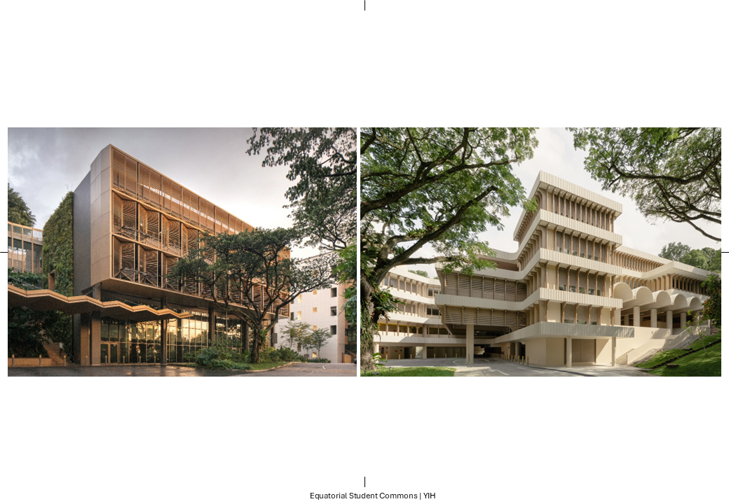
Q: What was the original design by AWP as context for this redesign? Maybe can outline URA concerns for NUS. This is particularly interesting as URA had not been seen to intervene in even less sensitive proposals in NUS, yet in YIH, they were concerned. Was it climatic, place-making, or historical concerns in the original proposals?
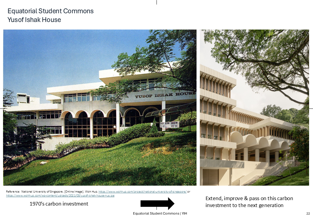
When the project frst landed on my desk, all we were told was that it had already been rejected by URA a couple of times. My sense was that the earlier proposals had transformed YIH too radically — stripping away its symbolic identity and making the renovation appear generic. The proposed glass-and-white palette evoked a laboratory or an offce building rather than a civic or student space.
From what I gathered, there were at least two prior submissions to URA. One version obscured the original arches entirely, covering them with a glass canopy. In another, the arches were slightly more visible, but remained purely decorative — detached from the architectural logic of the proposal. In contrast, our scheme brought the arches front and center, using them not only as a visual anchor but as an active part of the new architectural language.
Given YIH's unique historical and political signifcance, I believe it was entirely appropriate for URA to take a strong interest in the project. There is heritage embedded here — not just in the fabric, but in the building's institutional role and identity — and URA has always shown a sensitivity to that. Our approach aimed to respect and extend that legacy, rather than overwrite it.
Q: Do speculate. Clearly, the earlier design was sent back and the new one was accepted.
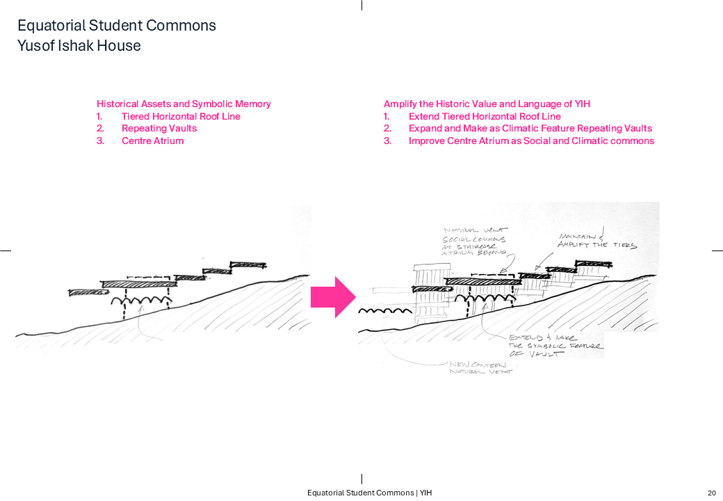
The original horizontal roofine and arches are amplifed and strengthened to form the primary architectural language of the new design. Rather than replacing them, the intent was to mine the existing vocabulary and elevate it — making it more present, more legible, and more signifcant.
Q: You seem to be drawing on various heritages here. Please expand this esp in the context of your Indo visits, etc.
Yes, while the design draws from various geographies, it is more specifcally rooted in a strain of mid-20th-century modernism that responded to climate in highly expressive and architectural ways. This period has fascinated me for the past two decades and formed the foundation of my Harvard Wheelwright research travels. It represents a moment when architecture offered a direct, physical response to climate — when environmental performance and formal ambition were deeply intertwined.
Given that much of the NUS campus was constructed at the tail end of this era, it felt both timely and appropriate to mine that architectural lineage. At YIH, I sought to reinterpret these climatic strategies — preserving their spatial and formal intelligence — while transforming the architecture through lighter-weight construction, contemporary materials, and a commitment to decarbonization. The result is a project that acknowledges its historical context while projecting forward, bridging the past and the future through climate-responsive design.
Q: Please discuss this terrain and climate strategy.
The existing terrain at Kent Ridge is quite steep, and the original design of Yusof Ishak House responded by cascading down the slope with a series of classrooms fanking a central staircase.
However, this stepped arrangement rendered the classrooms inaccessible for those with mobility impairments. To address this, a new lift core, egress ramps, and an additional foor were introduced to provide full accessibility. This new foor also serves to link the upper levels of YIH to the lift, enhancing circulation without undermining the building's logic.
At the same time, I was careful not to erase the character of the original design — particularly its distinctive overhanging roofine. Rather than removing it, I reinterpreted the roof profle as a series of horizontal strata along the elevation. These strata integrate accessibility interventions directly into the architectural expression, allowing the overhanging roofine to serve both as a shading device and as a visual register of the building's new inclusive circulation. In doing so, accessibility becomes embedded within the architectural language rather than appended to it.
The initial building was relatively enclosed, with bronze-anodized aluminum frames and bronze-tinted glazing. While a skylight offered some natural ventilation, the building was largely inward- facing and sealed. I reconnected the previously decorative vaults to the central atrium, transforming them into climatic straws that draw in air from the surrounding landscape. These vaults now facilitate cross-ventilation and thermal stack effect, linking the surrounding jungle to the heart of the building. The result is a more breathable, open, and climatically responsive interior that repositions the building in closer dialogue with its equatorial environment.
Q: This is a very interesting diagram and drawing. Please expand.
A worm's-eye axonometric illustrates how the climatic straws — repurposed vaults — link the exterior landscape to the building's interior. The drawing highlights the integration of spatial and climatic concerns, revealing the layered environmental strategies embedded within the design.
Q: This is a very interesting diagram and drawing. Please expand.
A thermal zoning diagram maps the building's varied comfort strategies — natural ventilation, hybrid conditioning, and fully air-conditioned zones — revealing how different thermal states coexist within the foor plate. This layered approach enables cross ventilation where possible, while strategically concentrating energy-intensive cooling only where necessary. The diagram underscores the building's calibrated response to climate, program, and use.
Q: The outcome images seem to have a very high level of formal coherence that is imageable, like in SDE 3. Can you make the connecting ideas between the 2 ways of approaching Skin, Climate, screen and shadow?
Formal coherence was a key consideration in the redesign, particularly given the multitude of competing demands placed on the building — including its own layered history of ad hoc additions and alterations. Coherence is something I value deeply, especially on a campus where architecture often reads as a patchwork of styles, scales, and disconnected intentions. I believe buildings should refect a consistent level of thought and care; in this case, it was important that the new intervention not only resolve the building's internal contradictions but also reconnect it to the broader language of the campus.
This approach aligns with the strategies employed at SDE1 and SDE3, where climate, context, and history are engaged holistically — most visibly through the building envelope. In all three projects, the envelope acts as both an environmental flter and a carrier of architectural meaning, foregrounding the campus's history while calibrating comfort and performance. There is also a deliberate oscillation in these buildings between part and whole, and between lightness and mass. While each project arrives at a different architectural expression, they share a common pursuit: to unify environmental performance with formal legibility and historical sensitivity.
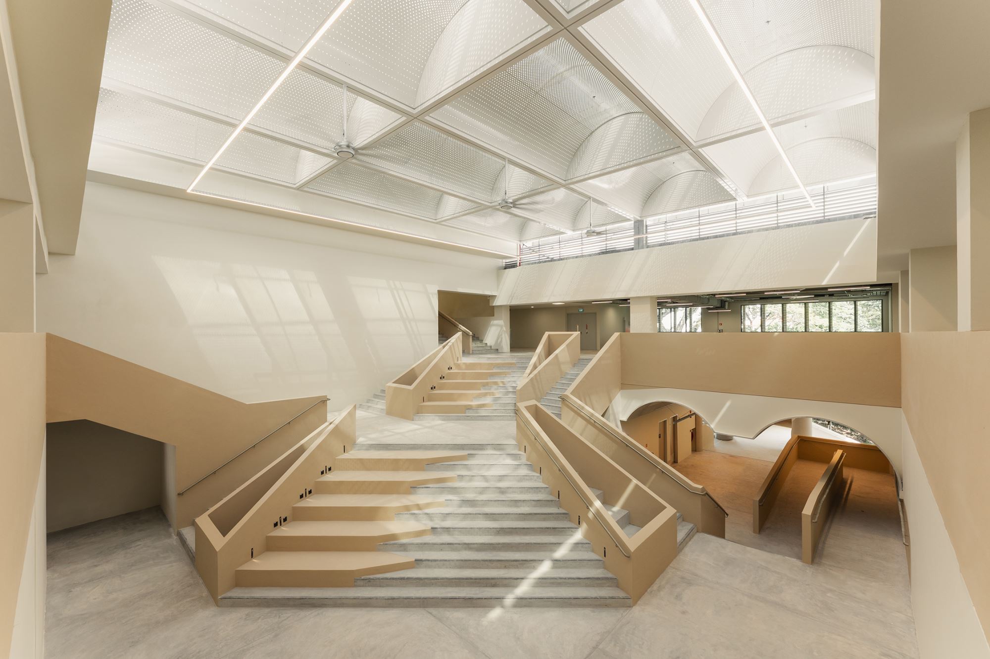
Within this framework, larger social spaces are intentionally created to allow students to gather, engage, chat, and debate. At SDE1 and SDE3, these communal areas were expressed at a more modest, intimate scale. At YIH, however, I took a bolder approach — amplifying the size and presence of these social volumes to foreground civic life at the heart of the building. These spaces not only serve pedagogical and communal functions but also reinforce the building's role as a social condenser on campus.
Figures
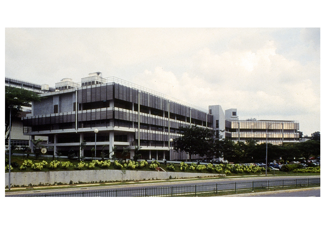
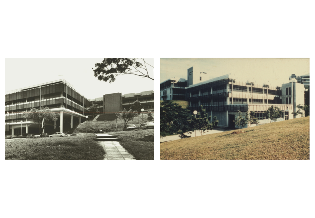
SDE 3 circa 1980s, Top: North West view. Bottom left: South West view and Main stairs to SDE3. Bottom right: SDE 1 circa 1980s

Top: SDE3 Circa 1990s, Bottom left: SDE3 Level 1 Circa 2000s, Bottom right: SDE3 Circa 1980s
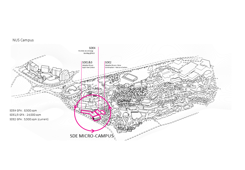
NUS conceived as an integrated network on a terrain circa 1980s
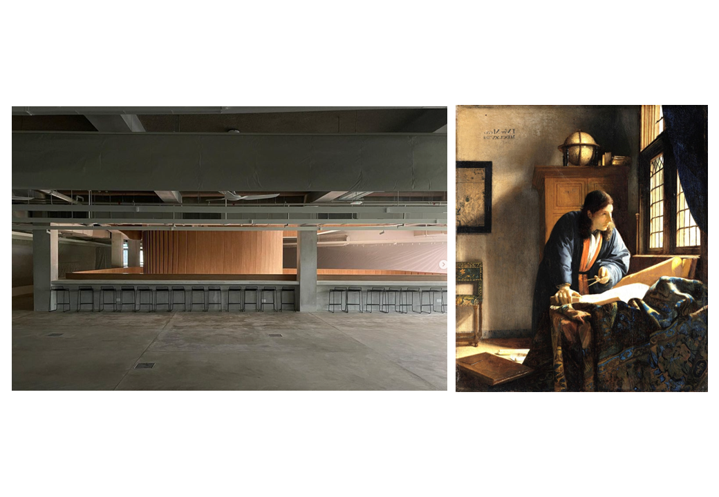
Left: SDE3 New Atrium showing light from the setting sun. Right: Image of The Geographer, J Vermeer.
Left SDE1 courtyard, Right: FAU building, University of Sao Paulo
Transposing the old facade elements into the new
Recovery of volume from removing the false ceiling
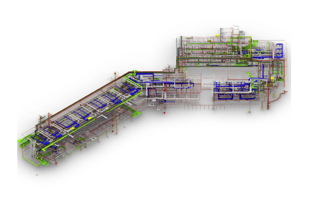
A digital twin to inform on the minutae of each system.
Blending new envelope into the old structural frame, yet maintaining a formal dialogue
New studio space to left and right
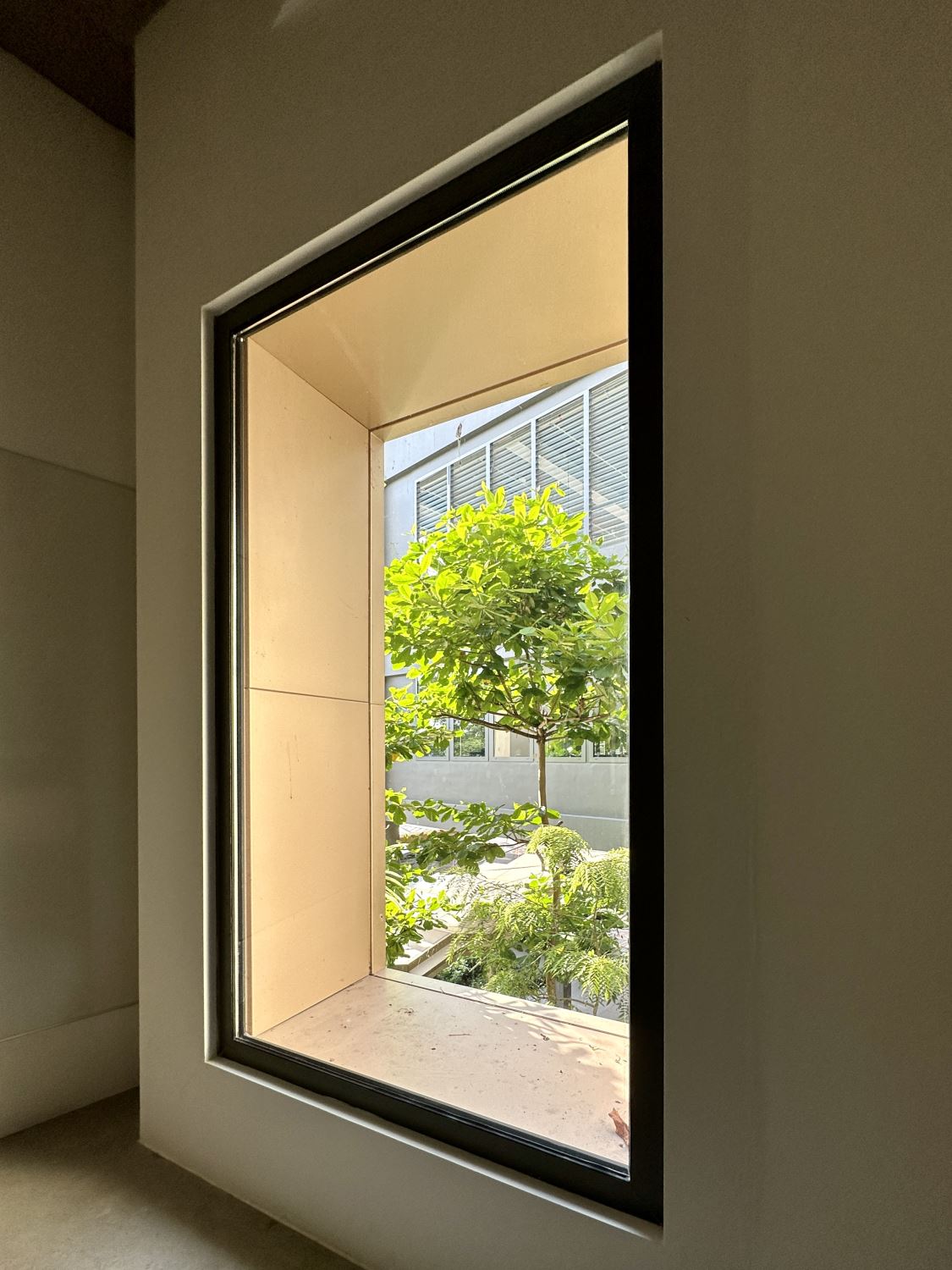
An immediate connection of inside and outside to the left and right
A refreshed interior
A rejuvenated pre lecture concourse and circulation paths
.jpg)
Changing the utilitarian focus to people and greenery
Lessons in geometry

.jpg)
.jpg)
Climatically responsive envelope details
A homage to the Breuer occulus for the Head of Department
.PNG)
YIH as a key focal point of student life as conceived in the 1980s master plan
.PNG)
Ed: There was no speculation ofered in reply but we can ofer a diagram that shows the clear use of regulating geometries which may suggest as stronger tie to the context and the original architecture that may inform why the new scheme is accepted
.PNG)
Aesthetics references from the region for the barrel vaults

The project also focuses on drawing in the cooling potential of surrounding green lung of Kent Ridge to the south east

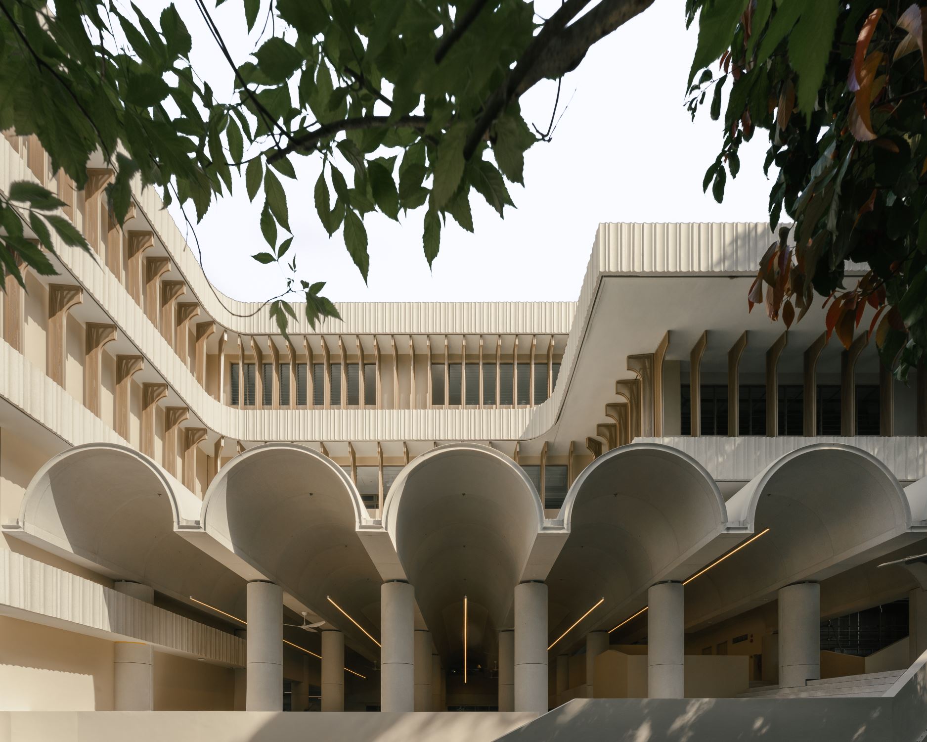
View form Kent Ridge Road. West corner
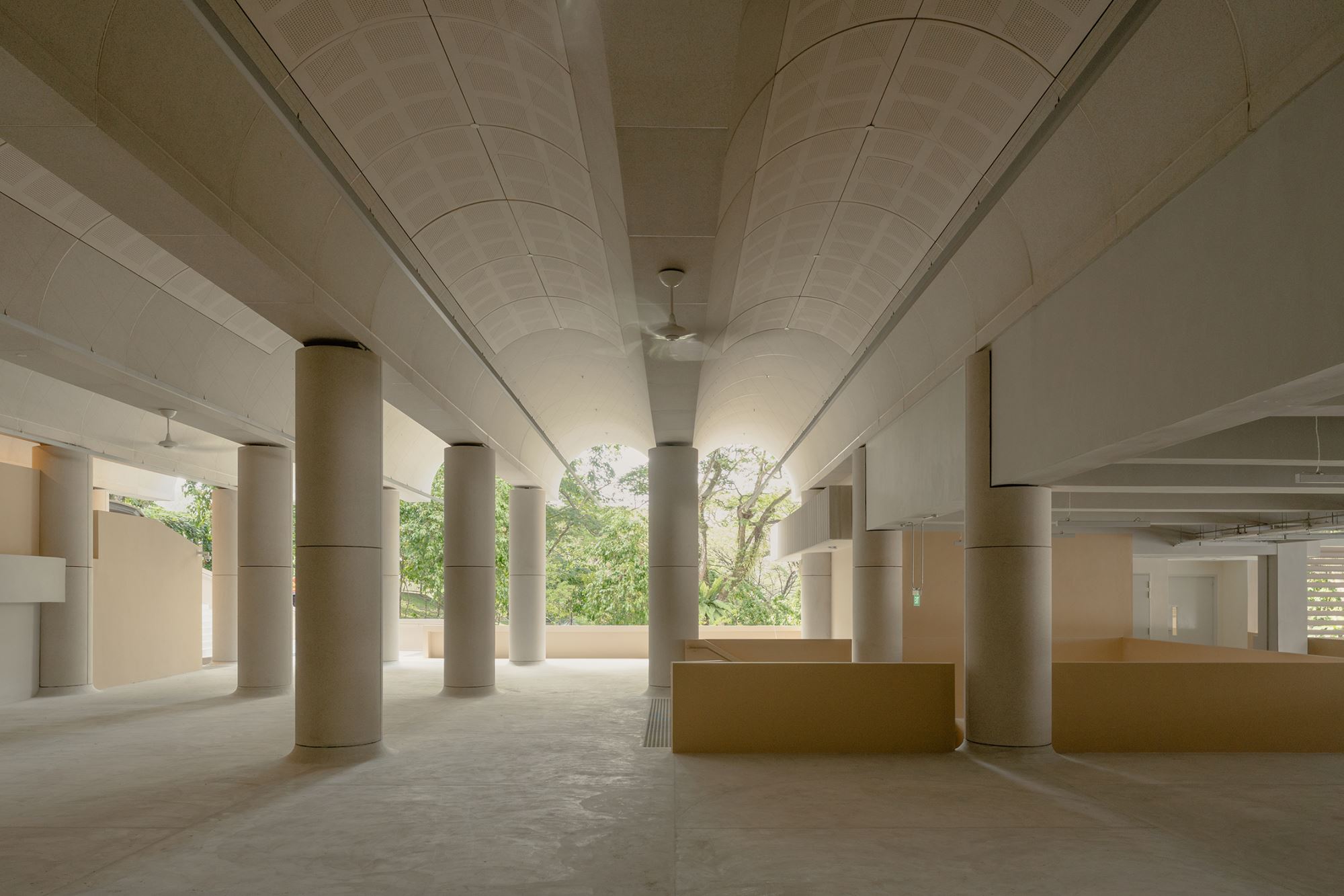
Level 2 Main concourse and barrel vaults
Level 2 Main concourse and new extended barrel vaults
Level 3 Upper concourse or point of rotation showing the passage that comes down from Kent ridge


 loading......